
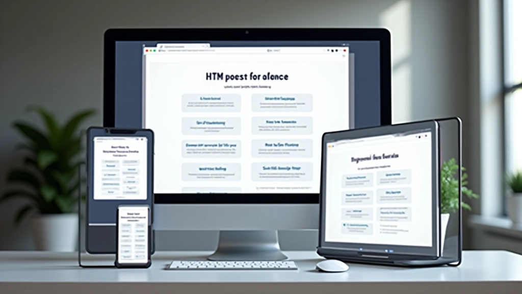
Building Responsive Designs with CSS
Mobile-first methodology, flexible grids, and media queries. We’ll show you how to make websites that look great on every device without extra work.
Why Responsive Design Matters
Here’s the reality: over 60% of web traffic comes from mobile devices. If your website doesn’t work on a phone, you’re losing half your audience before they even start. The good news? Building responsive designs isn’t complicated once you understand the core principles.
Responsive design isn’t about cramming a desktop site onto a phone. It’s about creating a flexible foundation that adapts beautifully to any screen size. You’re not making separate sites — you’re building one site that’s smart enough to reshape itself. That’s the real power here.

Start with Mobile First
Mobile-first means you design for phones first, then expand upward. It’s backward from what most people expect, but it works brilliantly. Why? Constraints force clarity. When you’ve got 320 pixels of width, you can’t include unnecessary elements. You build the essentials.
Start by asking: what does someone actually need on a phone? Not fancy animations or complex layouts. They need readable text, tappable buttons, and fast load times. Once you nail that, adding desktop features becomes straightforward. Your CSS becomes simpler because you’re adding features, not removing them.
Mobile-first isn’t a nice-to-have — it’s the foundation. Every major tech company does this. Desktop enhancements come later through media queries and additional CSS rules.
Flexible Layouts with Flexbox
Flexbox is your go-to tool for responsive layouts. It’s designed specifically for creating flexible containers that adapt to their content. Instead of calculating percentages and dealing with floats, you tell flexbox how to distribute space, and it figures out the rest.
Here’s what makes it powerful: flex items automatically adjust their size based on available space. You can make something take 50% on desktop and 100% on mobile without any calculations. Add gap spacing, alignment controls, and you’ve got a system that adapts to any screen.
- Automatic space distribution between items
- Alignment without floats or positioning hacks
- Wrapping content that adapts to container width
- Equal height columns without extra markup
Media Queries: The Adaptation Engine
Media queries are the mechanism that makes responsive design possible. They’re CSS rules that only apply when specific conditions are met — usually screen width. You write them as checkpoints where your design needs to change.
The standard breakpoints are 768px for tablets and 1024px for desktops. But don’t memorize these. Instead, find where your design actually breaks. Does it look cramped at 600px? That’s where you add a media query. Does it stretch too wide at 1200px? Add another. Your design dictates the breakpoints, not the other way around.
Typical breakpoint structure:
Mobile: 320px to 767px | Tablet: 768px to 1023px | Desktop: 1024px and up
Fluid Typography Scales Smoothly
Fixed font sizes don’t work for responsive design. 16px looks massive on a phone but tiny on a 4K monitor. The solution? Fluid typography that scales based on viewport width. Instead of jumping between sizes at breakpoints, text grows continuously.
Use the clamp() function to set minimum, preferred, and maximum sizes. Your heading might be 24px on phones, 32px on tablets, and 48px on desktops — all in a single line of CSS. No media queries needed for typography anymore. The browser handles the scaling automatically.
Better Readability
Text always fits the screen without awkward line breaks or tiny font sizes.
Cleaner Code
One typography rule instead of three media queries for each size change.

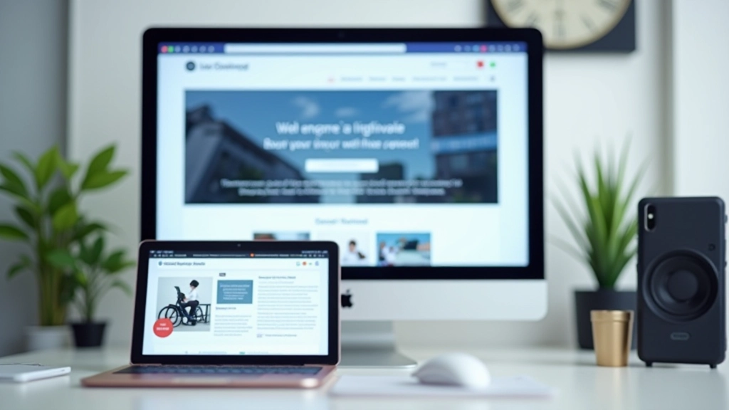
Images That Actually Respond
Images need to be responsive too. Set max-width: 100% and height: auto on all images, and they’ll scale down to fit their container. But that’s just the start. You can also use the picture element with srcset to serve different image sizes based on device capabilities. Phones get smaller files, desktops get full resolution.
This isn’t about cramming one image into different sizes. It’s about sending the right image to the right device. A 2000px image serves no purpose on a 375px phone screen. You’re wasting bandwidth and slowing down the site. Responsive images fix this completely.
Putting It All Together
Building responsive designs is about embracing flexibility. You’re not creating multiple versions of your site — you’re building one site that adapts intelligently. Mobile-first thinking keeps you focused. Flexbox handles layout. Media queries manage major changes. Fluid typography scales smoothly. Responsive images serve smart files.
Start with a phone-sized viewport. Build the essential experience. Add flexbox for flexible layouts. Test at actual breakpoints where things break. Use media queries to fix those breakpoints. Add fluid typography and responsive images. That’s the workflow that works.
The best part? Your site doesn’t just work on phones and desktops. It works beautifully on every device in between. That’s what responsive design delivers — one quality experience for everyone, regardless of how they’re viewing your site.
Educational Note
This article provides educational information about responsive web design principles and CSS techniques. The examples and approaches described are general best practices. Individual project requirements may vary. For specific implementation details, consult current CSS specifications and test thoroughly across devices. Browser support varies, so always verify compatibility for your target audience.
Continue Learning